A website about global warming built with inclusive design as the main focus — personas, usability testing, keyboard navigation, screen reader support and a Lighthouse score of 100.
← Back to projectsAccessibility, Usability and Ethics is a web project about making information on global warming easier to access, understand and use. The website was built to raise awareness about the environmental crisis, but the main focus of the project was accessibility and usability.
This project is included in my portfolio because it shows a different side of my web development work. Instead of focusing mainly on fullstack functionality, this project focuses on inclusive design, user needs, testing and ethical responsibility.
For future employers, it shows that I do not only think about whether a website works technically, but also about who can actually use it.
Important information is not useful if people cannot access it. A website about global warming should be available to users with different needs — people who use screen readers, navigate with a keyboard, need stronger contrast, have difficulty reading, or need text alternatives for audio content.
The problem was therefore not only to create an informative website, but to create a website that could be used by as many people as possible. Accessibility and usability had to guide the structure, content and design choices.
My role was to build and evaluate the website with accessibility and usability as the main focus. I worked with personas, user goals, task-based testing and accessibility checks. The goal was to make design decisions based on user needs instead of only designing from my own perspective.
I focused especially on keyboard compatibility, screen reader support, text alternatives, readable structure, contrast and simplicity. I also used accessibility testing tools to check the site and improve it against WCAG-based criteria.
An iterative process: understand user needs, test tasks, find issues, improve, test again.
The process started by identifying different users and their needs. The personas included users who were blind, had low vision, were deaf, had difficulty reading, had tremor in their hands, or had difficulty with visual comprehension. This made accessibility more concrete — each design choice could be connected to a real situation.
I then tested whether users could complete important tasks. One test focused on whether a blind user could navigate the first section of the page with a screen reader. Another test focused on whether a deaf user could access podcast content through a text transcript. These tasks helped show whether the site was usable in practice — not just whether it looked finished.
The process was iterative: test, find issues, improve and test again. This helped me understand that accessibility is not something that should be added at the end. It affects navigation, markup, content, contrast and interaction from the beginning.
Each choice below was made to improve usability for a specific group of users — not just to pass a test.
Keyboard navigation
The website was built to support keyboard navigation, because not every user can use a mouse. This is important for screen reader users and for users with motor difficulties.
Text alternatives for audio
Audio content was supported with text alternatives, so users who cannot hear audio could still access the content. Text content was also structured so it could be read properly by assistive technology.
Simplicity and readability
I avoided unnecessary clutter and focused on making the information easier to follow. This helped users with visual difficulties, reading difficulties and cognitive overload.
Contrast and text sizing
Color contrast, text size and spacing were all chosen to be readable and comfortable. Accessible contrast benefits all users — not only those with visual impairments.
Semantic HTML structure
Headings, tab order, landmarks and ARIA attributes were used deliberately so assistive technology could correctly interpret and navigate the page.
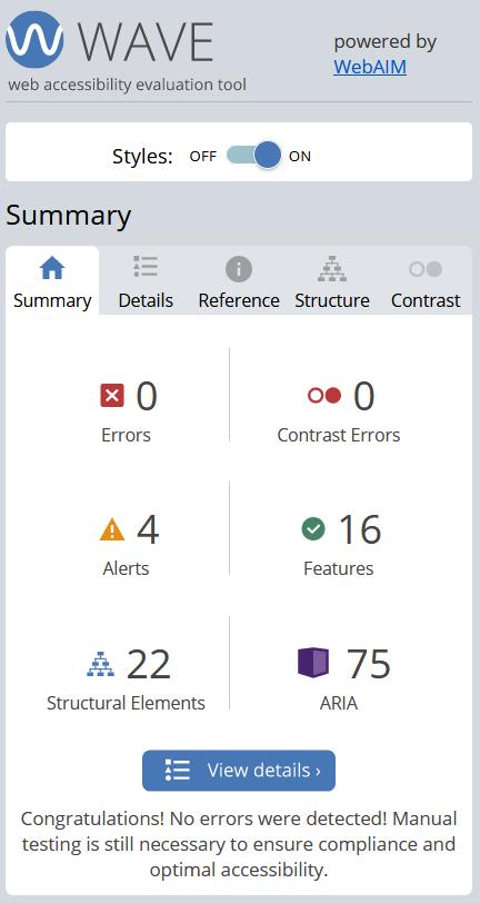
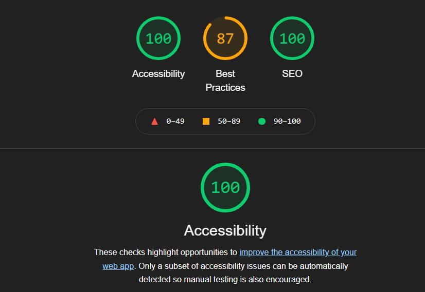
Testing with tools
WAVE showed zero errors and zero contrast errors. Lighthouse showed a perfect accessibility score of 100.
The project was built with HTML, CSS and a small amount of JavaScript. HTML structure was important because semantic markup, headings, tab order and ARIA affect how assistive technology understands a page.
CSS was used with accessibility in mind — especially contrast, spacing and readability. The goal was not only to make the site look good, but to make it comfortable and possible to use.
JavaScript was kept limited, which made the site simpler and reduced the risk of creating interactions that would be difficult to use with assistive technology.
The final result was a website about global warming where accessibility and usability were the main priorities. The site was tested with different user needs in mind and improved through evaluation.
The project showed that accessibility is not just a technical checklist. It is a design responsibility. A website can contain important information, but if users cannot navigate it, read it, hear it or understand it, then it does not fully work.
This project is important in my portfolio because it shows that I think about web development as more than code and layout. It shows that I can work with accessibility, usability, user needs and ethical design choices.
I learned that accessibility should be considered early in the process, not added at the end. It affects the whole structure of a website — from content and navigation to markup and testing.
If I continued the project, I would add more manual testing with real users, document each accessibility decision more clearly and improve the navigation further with features like a visible skip link. I would also check the site against newer WCAG criteria and continue improving the connection between user needs, design choices and test results.
This project shows a side of web development that is easy to overlook: who can actually use what you build. For me, it reinforced that technical skill and inclusive thinking go together — and that accessibility is not a constraint, but a quality standard.